 Ever since Robert Louis Stevenson had Jim Hawkins
discover a treasure map in his classic book, Treasure Island, finding
one has became the passion of many. While many people dream about
discovering a treasure map that leads to riches, sometimes it’s the old
map, itself, that’s worth money. Ever since Robert Louis Stevenson had Jim Hawkins
discover a treasure map in his classic book, Treasure Island, finding
one has became the passion of many. While many people dream about
discovering a treasure map that leads to riches, sometimes it’s the old
map, itself, that’s worth money.
Collectors seek out maps for many reasons. Some appreciate
the beautiful artwork and intricate etchings on early maps and purchase them
for decorative purposes. Others seek all maps depicting a specific
geographic area and want representative examples of all time periods showing
changes resulting from exploration, wars, or just an increase in population.
"Collectors should buy what they like," said
John Sandberg of the Yellowhouse Gallery, Nags Head, North Carolina, who
sells both old maps and nautical charts of the Outer Banks. "They
shouldn’t think about how a map will appreciate in value."
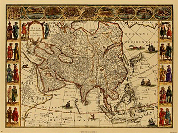
An antique map, like any other antique, is one that was
printed over 100 years ago. Beginning with those printed around 1550,
cartographers depicted the exploration and discoveries made throughout the
world during the next 350 years. During the 17th and 18th centuries,
cartography became one of the highest forms of fine art.
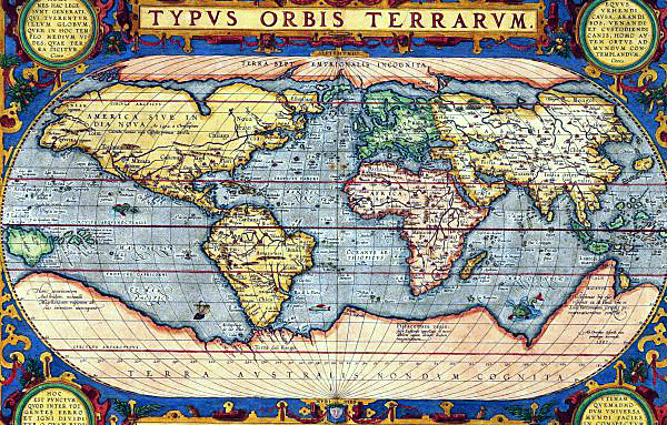 Maps have always had an immediate visual appeal, whether
in the more elaborately engraved, highly decorative style so much loved by
early map-makers and publishers, or the elegant simplicity, but high
technical accuracy, of the modern map. Maps have always had an immediate visual appeal, whether
in the more elaborately engraved, highly decorative style so much loved by
early map-makers and publishers, or the elegant simplicity, but high
technical accuracy, of the modern map.
Seventeenth-century Spanish author Miguel Cervantes
Saavedra wrote that by simply looking at a map a person could: "Journey
all over the universe, without the expense and fatigue of traveling, without
suffering the inconvenience of cold, hunger and thirst." To look at an
old map is also to see the world as it would have been seen by the kings,
aristocracy, government, the military, merchants and navigators of the day.
Studying a map is to step into the past to see countries, places and people
as they once were.
Maps above all tell of man's strivings, the quest to see
what’s on the "other side of the hill," across the river, or
over the sea, and then his desire to record where he has been and what he
has seen. They’re the visual record of European expansion to America, for
example Henry Briggs' map marking the English settlements of 'James Citie' (Jamestown,
Virginia)
and 'Plymouth (Massachusetts)
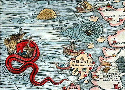
Just as some collectors look for accuracy, others look for
inaccuracy-- towns incorrectly sited, coastlines incorrectly charted, and
rivers incorrectly routed. They also look for the anachronisms--travelers'
tales and fables adopted as fact by gullible map makers--sea-monsters that
inhabit many early charts or the fanciful medieval creatures and distorted
images of more factual animals that populated the public’s imagination.
Then there are the misconceptions: California as an
island, the fictitious islands of Brasil and Frisland, the legendary Seven
Cities of Cibola, and Raleigh's mythical Lake Parime, with the city of Manoa,
the site of El Dorado. It’s all these things, and many more, that make
maps such a popular collectible.
The Beginnings
Map making began in 150 A.D. when Claudius Ptolemy, an Alexandrian
geographer, wrote about the world as he knew it. It was from his text that
27 maps were constructed and printed in the first atlases. The first edition
with maps, which were probably engraved by Taddeo Crivelli, was published in
Bologna in 1477. Three similar sets were published in Rome, by Arnold
Buckinck in 1478, for Francesco Berlinghieri, in Florence in 1482, and by
Lienhart Holle, in Ulm, Germany, in 1482.
 From 1544, there was a great upsurge in the number of
people publishing maps in Italy, based in the twin centers of Rome and
Venice. These publishers, working independently, produced their maps in
different sizes up to nine sheets or more. Gradually it became the fashion
to bind the maps together, into composite atlases--frequently called Lafreri
atlases after one of the leading publishers of the period, or less commonly IATO
atlases (Italian, Assembled To Order). From 1544, there was a great upsurge in the number of
people publishing maps in Italy, based in the twin centers of Rome and
Venice. These publishers, working independently, produced their maps in
different sizes up to nine sheets or more. Gradually it became the fashion
to bind the maps together, into composite atlases--frequently called Lafreri
atlases after one of the leading publishers of the period, or less commonly IATO
atlases (Italian, Assembled To Order).
A while later, the practice of dissecting a map and
mounting it on linen inside a slipcase became fashionable, presumably for
ease of storage and use. In the 19th century, publishers started
to issue single-sheet maps in protective covers, from which they would fold
out. While, a relatively safe way of storing the map, repeated folding and
unfolding caused tension along the folds and at the joins of folds, which
soon gave way.
While printers made maps available since the mid-1400s,
they produced the majority of antique maps from the 16th to the early 19th
centuries. Generally, the earlier dates are highly sought after, but the
field of collecting is vast.
Printing Maps
Printers generally printed early maps using woodcuts--a wooden block which
had been cut in relief (the printed area standing out from the rest) and
then inked, such as those of Munster (c1550) among others, most of which
were printed in black and white.
 However, printers used copper and steel engraving to
create the majority of antique maps that can be found today. In this
process, an engraver cut a reverse image into a metal plate which he then
inked and wiped, so that ink only remained in the incised lines. Afterwards,
he passed the plate through a roller press with dampened paper laid over the
image. The press exerted considerable pressure forcing the paper into the
incised lines to take up the ink. This method was capable of reproducing an
image with fine detail. Copper, a softer metal, in common use from the early
1500's until about 1820, would produce relatively few maps before having to
be re-engraved. Steel quickly replaced copper in the early 19th
century because finer lines could be engraved and far more maps printed on
this harder metal. Printers used steel on nearly all engraved maps after
1830. However, printers used copper and steel engraving to
create the majority of antique maps that can be found today. In this
process, an engraver cut a reverse image into a metal plate which he then
inked and wiped, so that ink only remained in the incised lines. Afterwards,
he passed the plate through a roller press with dampened paper laid over the
image. The press exerted considerable pressure forcing the paper into the
incised lines to take up the ink. This method was capable of reproducing an
image with fine detail. Copper, a softer metal, in common use from the early
1500's until about 1820, would produce relatively few maps before having to
be re-engraved. Steel quickly replaced copper in the early 19th
century because finer lines could be engraved and far more maps printed on
this harder metal. Printers used steel on nearly all engraved maps after
1830.
Surface printing or lithography also started in the early
1800's and allowed the artist or cartographer to draw directly onto a
specially prepared stone–for several colors, he used several stones. This
was cheaper and faster since lithography required no engraver, but most
lithographic maps have a fuzzy quality. By the late 1880's modern machine
lithography and printing took over and maps lost their decorative quality.
 Some maps were never meant to be colored but most antique
maps look better with appropriate hand coloring. Ideally, collectors would
like to find maps with original hand color that’s applied at the time of
printing. However, not all original hand color was well done or even applied
correctly. So called "later" or "modern" hand color,
skillfully applied, can be aesthetically pleasing, but only if done in a
style appropriate to the map maker or the map’s period. Some early hand
color can burn the paper, particularly browns and greens which have oxidized
over the centuries. This may be an unavoidable blemish in some maps from the
1600's. In the end, color is simply a question of taste for the individual
collector and doesn’t add to the value. Some maps were never meant to be colored but most antique
maps look better with appropriate hand coloring. Ideally, collectors would
like to find maps with original hand color that’s applied at the time of
printing. However, not all original hand color was well done or even applied
correctly. So called "later" or "modern" hand color,
skillfully applied, can be aesthetically pleasing, but only if done in a
style appropriate to the map maker or the map’s period. Some early hand
color can burn the paper, particularly browns and greens which have oxidized
over the centuries. This may be an unavoidable blemish in some maps from the
1600's. In the end, color is simply a question of taste for the individual
collector and doesn’t add to the value.
Before the 19th century, maps were usually
published uncolored. During the 16th and 17th
centuries, map coloring became recognized as a trade in its own right,
effectively being a continuation of the work of the illuminator. Artists
used watercolor to elaborately color maps, following more or less
standardized colors which are still applicable today--such as brown for
hills, red for cities and larger towns, blue for water, and green for
woods--and often highlighted them with gold paint.
During the 19th century, it became more common
for maps to be published with hand color in varying degrees of quality. Some
may have had very simple outline color applied and others may have had full
wash color over much of the image area. But with the advent of reasonably
cheap color printing during the 1860's, hand coloring became less common.
Dealers use three terms to distinguish a map’s color:
"Original coloring," or any map with original hand color applied
soon after publication. "Old coloring," or color that’s old, but
not original--the map may be 200 years old but the color might possibly be
100 years old. And "recent coloring," or color that’s recently
applied using more modern paints, either currently or sometime earlier this
century.
Symbols and Such
Elaborate cartouches giving the title, the cartographer, the dedication and
perhaps details of scale, as well as compass roses, ships, sea monsters and
human figures gave the map painter ample scope to use his imagination,
although to some extent the colors of these, too, were governed by the
fashions of the period. Those on woodcuts were simple but on engraved maps
they became more elaborate through the 16th and 17th
centuries. Eventually, they became less formal, influenced by the baroque
and rococo periods but often incorporating many aspects of the life of the
times, especially scenes in tropical lands.
 Before 1550, for example, artists represented the sea with
swirling lines, then stippling became the vogue and later still a wash of
plain color was used. In early maps, towns were shown disproportionately
large and were indicated by towered castles and house roofs, but after the
first quarter of the 16th century, artists replaced the castle
symbols with church spires or towers and began to include coats-of-arms,
ships and cherubs with wind issuing from their mouths. In most woodcut maps,
artists represented hills using caterpillar-like lines which in the later
1500's gave way gently rising mounds. Then towards the end of the 17th
century, the first attempts were made to give a true indication of height
and slope by means of appropriate shading. From the mid-l6th century to the
18th century, decorative cartography and, technical achievement reached its
zenith. Usually, the older the map, the more embellishments it has. Before 1550, for example, artists represented the sea with
swirling lines, then stippling became the vogue and later still a wash of
plain color was used. In early maps, towns were shown disproportionately
large and were indicated by towered castles and house roofs, but after the
first quarter of the 16th century, artists replaced the castle
symbols with church spires or towers and began to include coats-of-arms,
ships and cherubs with wind issuing from their mouths. In most woodcut maps,
artists represented hills using caterpillar-like lines which in the later
1500's gave way gently rising mounds. Then towards the end of the 17th
century, the first attempts were made to give a true indication of height
and slope by means of appropriate shading. From the mid-l6th century to the
18th century, decorative cartography and, technical achievement reached its
zenith. Usually, the older the map, the more embellishments it has.
The makers often used Latin phrases along the borders or
in the legends of their maps. Words like sculpsit, fecit, caelavit,
and incidit or incidente referred to the engraver. Excudit,
sumptibus, apud, ex officina, formis referred to
the publisher or printer. Descripsit, delineavit, invenit,
auctore referred to the draftsman or cartographer.
When the fragility of maps is considered, it’s
remarkable that so many survived over 300-400 years. Apart from those
manuscript maps and charts produced on vellum or parchment, most early maps
which collectors are likely to find were printed on strong, thick hand-made
paper from France, Germany and Switzerland and the finest of all from the
Ancona area of Northern Italy. The English produced paper on a limited scale
during the 16th century, but usually it was imported from France
until about 1610 when good English handmade paper became available in
quantity.
Practically all early paper bore a watermark which can be
a useful guide in dating a map. A batch of paper might have been used for a
limited number of prints for as long as 20 or 30 years but, considered in
conjunction with other clues, a date of printing can be sometimes closely
determined. The absence of a watermark doesn’t necessarily imply that a
map is a fake nor does it have any effect on its value.
The size of the paper printers used for maps was
conditioned by the size of the trays used for making paper by hand--28 x 24
inches--and by the size of the presses available. In the early days, paper
makers produced paper almost entirely from linen and rags pulped in water.
After thorough mixing, they dipped a close-meshed wire tray into the pulp
and lifted out a sufficient amount to give the required thickness of paper.
Next, they drained the water off the sheet and dried it between layers of
felt. They hung it to dry. The wire mesh of the tray, into which they worked
the watermark, produced the vertical and horizontal lines seen when holding
an old map up to the light.
Antique maps can be divided into four main groups,
depending on how a single sheet of paper can be folded. Double f olio refers
to maps printed on a complete sheet, generally measuring about 20" by
25", then folded and bound into an atlas, each sheet or
"folio" or "feuille" being a page. Quarto refers to maps
printed on one quarter of a sheet, generally about 10" by 13".
Octavo refers to maps printed on one eighth of a sheet,
generally about 5" by 7". However, printers created maps as small
as 3.5" x 4.5" during the late 16th and early 17th
centuries.
Read more about old maps. < Back to
Antiques Articles
Go to the next antiques article > |